Single-cell RNA-seq lets us ask biological questions at a resolution that was unthinkable a decade ago — but answering those questions still comes down to a classical problem: which statistical model fits the question I’m asking? Linear models (LM), generalized linear models (GLM), and generalized additive models (GAM) look interchangeable on a slide deck, but they answer fundamentally different questions. Pick the wrong one and you either miss real biology or report patterns that aren’t there.
This post walks through all three using a single running analogy — coffee and productivity — and then maps that analogy directly onto single-cell gene expression, disease progression, and the tools you’ll actually run.
The single question behind everything
Most single-cell modeling tasks collapse into one of three shapes:
- Does gene expression differ between disease and control?
- Does a gene change along disease progression (pseudotime)?
- Is the relationship between expression and a covariate linear, or something more interesting?
Each of those questions has a natural home — LM, GLM, or GAM — and the rest of this post is about matching them up.
The running analogy: coffee ☕ and productivity
We’ll use one analogy and stretch it across all three models so the differences are easy to spot:
- Productivity → gene expression (or regulon activity)
- Coffee intake → disease progression score / pseudotime
- Sleep, stress, time of day → covariates (batch, donor, sequencing depth)
The mapping looks like this:
pseudotime"]) B2(["Gene expression
regulon activity"]) B3(["Batch · Donor
nUMI · % mito"]) end A1 ==>|maps to| B1 A2 ==>|maps to| B2 A3 ==>|maps to| B3 style Analogy fill:#FFF8E1,stroke:#E65100,stroke-width:3px,color:#BF360C style Biology fill:#E8F5E9,stroke:#1B5E20,stroke-width:3px,color:#1B5E20 style A1 fill:#FFE0B2,stroke:#BF360C,stroke-width:2px,color:#3E2723 style A2 fill:#FFF59D,stroke:#F57F17,stroke-width:2px,color:#3E2723 style A3 fill:#FFCDD2,stroke:#B71C1C,stroke-width:2px,color:#3E2723 style B1 fill:#C8E6C9,stroke:#1B5E20,stroke-width:2px,color:#1B5E20 style B2 fill:#B2DFDB,stroke:#00695C,stroke-width:2px,color:#004D40 style B3 fill:#BBDEFB,stroke:#0D47A1,stroke-width:2px,color:#0D47A1
Linear Models (LM): every cup is the same cup
A linear model assumes a straight-line relationship:
\[Y = a + bX\]Coffee version: Every additional cup of coffee gives you exactly the same productivity bump. Cup #1 and cup #5 are equally magical.
Single-cell version: Gene expression increases (or decreases) by a fixed amount for every unit of progression.
That assumption is rarely true in biology. Real genes saturate, peak, switch on and off, and respond to thresholds. LMs also assume the response is continuous and roughly normal — gene counts are neither. For these reasons, a plain LM is rarely the right tool for raw scRNA-seq data, though it does underpin fast methods like limma-voom once counts have been transformed with precision weights [1].
Generalized Linear Models (GLM): counting tasks, not vibes
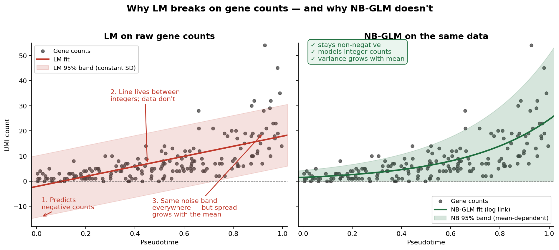
Why LM breaks on gene counts
Before we introduce GLMs, it helps to see exactly where LM fails. Gene expression in scRNA-seq is measured as UMI counts — integers that are bounded at zero, heavily skewed, and have variance that grows with the mean. An LM handed raw counts can only do one thing: pretend they’re continuous, symmetric numbers with constant noise. It cannot keep predictions above zero, it cannot respect that counts are integers, and it cannot handle the fact that highly expressed genes are noisier than lowly expressed ones. Feed raw counts into an LM and it will happily predict negative expression and badly mis-estimate uncertainty across the dynamic range. It’s not a small issue; the tool simply doesn’t match the data.
GLMs fix this in two linked ways: they let the response follow a distribution that fits counts (Poisson or negative binomial), and they connect the predictor to the mean of that distribution through a link function — usually log, which keeps predictions positive.
Coffee version: overdispersion, explained with a crowd
Instead of a fuzzy “productivity score,” you now count something concrete: tasks completed per hour. Good so far — but here’s the twist. You measure ten different people, all on exactly 3 cups of coffee. A Poisson model would predict that everyone lands near the same task count, with only tiny random wobble. Reality disagrees: Alice crushes 20 tasks, Bob does 8, Carol does 14. The spread between people is much larger than Poisson allows.
That extra spread has a name: overdispersion. It’s the gap between the variance a Poisson model expects and the variance your data actually show. And it’s exactly what separates a Poisson GLM from a negative binomial (NB) GLM — the NB distribution adds a dispersion parameter that absorbs this extra variability.
Single-cell version: why NB-GLM fits RNA-seq
Gene counts across biological replicates behave just like Alice, Bob, and Carol. Donor-to-donor variability, technical noise, and biological heterogeneity all inflate the variance beyond what Poisson can handle. A negative binomial GLM models this head-on:
\[\log(\text{Expression}) \sim \text{Condition} + \text{Covariates}\]The log link keeps predictions non-negative, the NB distribution absorbs overdispersion, and the design matrix lets you adjust for batch and donor at the same time.
Why DESeq2 and edgeR are the workhorses
This is the bridge to the tools. DESeq2 [2] and edgeR [3] are both negative binomial GLMs under the hood, and they became workhorses for a specific reason: they don’t just fit the NB model — they estimate per-gene dispersion and then shrink it toward a trend learned across all genes. That shrinkage step is what makes the models stable when you only have a handful of replicates (which, in single-cell experiments, is almost always the case). Match the distribution to the data, shrink the noisy bits, let covariates into the design — that combination is why these two tools have dominated differential expression for over a decade.
A modern wrinkle: pseudobulk
A subtlety worth calling out — if you’re doing differential expression between conditions in scRNA-seq, treating every cell as an independent replicate inflates false discoveries dramatically. The current best practice is to aggregate counts within each biological replicate (pseudobulk) and then run DESeq2 or edgeR on the aggregated matrix [4]. The GLM stays the same; what changes is the unit of analysis.
Generalized Additive Models (GAM): let biology draw the curve
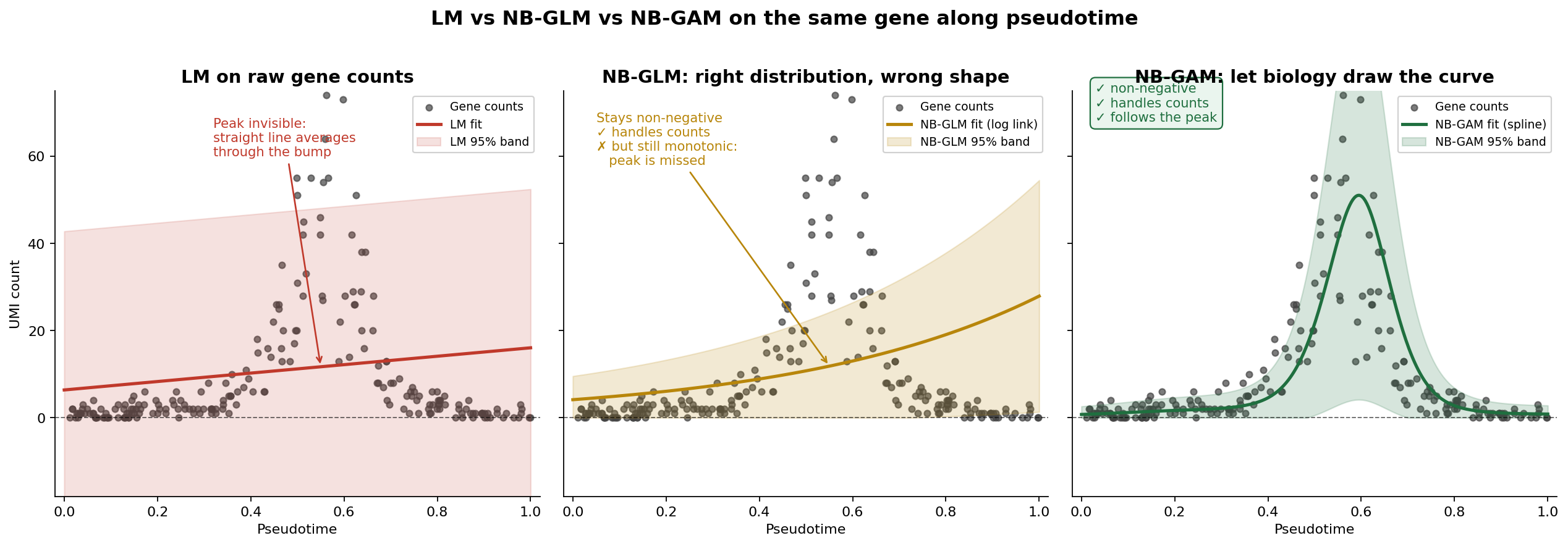
Why GLM breaks on trajectories
The GLM we just celebrated has a quiet assumption baked into it: the relationship between predictor and response is linear on the link scale. For group comparisons (disease vs control) that’s fine — there’s no “shape” to worry about, just a difference between two levels. But the moment your predictor becomes continuous and biological — like pseudotime along a disease progression — that assumption starts to hurt.
A log-linear GLM with pseudotime as a covariate can only do three things: go up, go down, or stay flat. It cannot bend. And real genes along trajectories almost never behave that way.
Coffee version: following one person across eight cups
Earlier we measured ten people at a fixed 3 cups and used NB-GLM to handle the spread across them. Now flip the experiment: follow one person across cups 0, 1, 2, all the way to 8, and count their tasks per hour at each step.
What actually happens?
- Cups 0–2: tasks climb steeply as caffeine kicks in
- Cup 3: peak performance
- Cup 4: still good, maybe plateauing
- Cup 5: jitters, tasks drop
- Cups 6–8: you’re staring at the ceiling; task count crashes
Now ask a log-linear GLM to model this. It’ll fit a single slope: either “more coffee = more tasks” (missing the crash) or “more coffee = fewer tasks” (missing the climb). Either way, the peak — which is the most interesting part — vanishes into an averaged-out line.
You could try to rescue the GLM by adding polynomial terms — cups², cups³, maybe cups⁴. But now you’re guessing the degree, polynomials wiggle badly at the edges of the range, and the “right” number of terms is different for every gene. It’s a losing game.
Why GAM prevails: splines with a wiggliness penalty
A GAM replaces the rigid linear predictor with a smooth function — usually a spline — that can bend as much or as little as the data justify:
\[\log(\text{Expression}) \sim s(\text{Progression}) + \text{Covariates}\]Two things make this work where polynomials fail. First, a spline is built from many small basis functions stitched together, so it can represent almost any shape without you specifying it in advance. Second — and this is the key — GAMs apply a wiggliness penalty during fitting. The more the curve bends, the more it gets penalized, and the level of smoothing is chosen automatically from the data (usually by REML or cross-validation). The result is a curve that’s as flexible as it needs to be, and no more.
Crucially, a GAM keeps everything good about the GLM. You still use an NB family with a log link for counts. You still add covariates for batch and donor. You just free the shape of the pseudotime effect so that rise-peak-crash patterns can actually be fit.
Why tradeSeq is the trajectory workhorse
tradeSeq [5] is the tool that brings this idea to single-cell data specifically. For each gene, it fits a negative binomial GAM along pseudotime — one smoother per lineage — and then gives you a menu of tests built on top of that fit: is the gene associated with pseudotime at all? Does its start differ from its end? Do two lineages diverge from each other, and if so, where? It also supports cell-level weights to handle zero-inflation from dropout-prone protocols. That combination — NB-GAM per gene, per lineage, with biologically meaningful tests layered on top — is why tradeSeq is the default engine for trajectory-based differential expression.
━━━━━━
Straight line
Y = a + bX
Every cup = same boost"] GLM1["📊 GLM
━━━━━━
Linear on log scale
log Y = a + bX
Counts of tasks"] GAM1["〰️ GAM
━━━━━━
Flexible curve
Y = a + s(X)
Rise → peak → crash"] LM1 ==>|"add link +
count distribution"| GLM1 GLM1 ==>|"replace line
with smoother"| GAM1 style LM1 fill:#BBDEFB,stroke:#0D47A1,stroke-width:3px,color:#0D47A1 style GLM1 fill:#FFE0B2,stroke:#E65100,stroke-width:3px,color:#BF360C style GAM1 fill:#E1BEE7,stroke:#4A148C,stroke-width:3px,color:#4A148C
Covariates: the sleep and stress you can’t ignore
You’re studying coffee → productivity, but you also had a terrible night’s sleep, skipped lunch, and your boss has been hovering. If you don’t record those, you’ll blame (or credit) coffee for effects it didn’t cause.
Covariates play the same role in single-cell models. The usual suspects:
Technical: batch, library size (nUMI), percent mitochondrial reads, sequencing run
Biological: donor ID, age, sex, disease stage (when it’s a nuisance rather than the variable of interest)
Both GLMs and GAMs let you add covariates as fixed-effect terms:
\[\text{GLM:}\quad \log(\text{Expression}) \sim \text{Condition} + \text{Batch} + \text{Donor}\] \[\text{GAM:}\quad \log(\text{Expression}) \sim s(\text{Progression}) + \text{Batch} + \text{Donor}\]Skip them and you risk attributing batch effects to biology — the most common way to get excited about a finding that won’t replicate.
DGE vs trajectory: two questions, two pipelines
This is the distinction most people get tangled in. GLM-based DGE and GAM-based trajectory analysis are not competing methods — they answer different questions.
biological question?} Q -->|Groups:
disease vs control| DGE[Differential Expression] Q -->|Continuous:
along progression| TRAJ[Trajectory Analysis] DGE --> PB[Aggregate to pseudobulk
per sample x cell type] PB --> GLM_Tool[DESeq2 / edgeR
Negative Binomial GLM] GLM_Tool --> GLM_Out([Log fold change
+ p-value]) TRAJ --> PT[Infer pseudotime
Slingshot / Monocle] PT --> GAM_Tool[tradeSeq
Negative Binomial GAM] GAM_Tool --> GAM_Out([Smooth expression curve
+ association p-value]) style DGE fill:#FFE4B5 style TRAJ fill:#DDA0DD style GLM_Tool fill:#FFE4B5 style GAM_Tool fill:#DDA0DD style GLM_Out fill:#90EE90 style GAM_Out fill:#90EE90
Why GAMs don’t give you a fold change (and why that’s fine)
People often read “GAM has no fold change” as a weakness. It isn’t — it’s a category difference.
Fold change requires two reference points: a before and an after. In a GLM with disease vs control, those points are obvious. In a trajectory, there’s no natural boundary — just a continuous ribbon from early to late. Forcing a single fold-change number onto that is like asking “how much louder is a song?” when the real answer is “it depends which second you’re asking about.”
When you do need a summary number from a GAM, sensible alternatives are:
- Start-vs-end contrast — expression at early pseudotime compared to late pseudotime (tradeSeq’s
startVsEndTest) - Dynamic range — maximum minus minimum along the curve
- Shape interpretation — describe whether the gene is early, mid, or late-peaking
A quick decision guide
continuous or grouped?} Q1 -->|Grouped:
disease vs control| Q2{Is your response
counts?} Q1 -->|Continuous:
pseudotime| Q3{Do you expect a
non-linear pattern?} Q2 -->|Yes - counts| GLM1[GLM
DESeq2 / edgeR
on pseudobulk] Q2 -->|No - already transformed| LM1[LM
limma-voom] Q3 -->|Yes - rise / peak / fall| GAM1[GAM
tradeSeq] Q3 -->|No - linear is fine| GLM2[GLM with
pseudotime as covariate] style GLM1 fill:#FFE4B5 style GLM2 fill:#FFE4B5 style LM1 fill:#ADD8E6 style GAM1 fill:#DDA0DD
Tool-to-model cheat sheet
| Tool | Model | Best for |
|---|---|---|
| DESeq2 | Negative binomial GLM | Group-based DGE on pseudobulk |
| edgeR | Negative binomial GLM | Group-based DGE on pseudobulk |
| limma-voom | LM + empirical Bayes | Fast DGE on transformed counts |
| tradeSeq | Negative binomial GAM | Trajectory / pseudotime DE |
Final intuition
A compact mental model:
- LM — “Draw a straight line through continuous, normal-ish data.”
- GLM — “Draw a straight line on the link scale, using a distribution that actually fits counts.”
- GAM — “Let biology draw the curve.”
Use GLM-based tools (on pseudobulk) when you’re comparing groups. Use GAM-based tools when you’re asking how something unfolds along a continuous biological process. Always include covariates. And remember that “GAM has no fold change” is not a bug — it’s a sign you’re asking a richer question.
References
- Law CW, Chen Y, Shi W, Smyth GK (2014). voom: precision weights unlock linear model analysis tools for RNA-seq read counts. Genome Biology 15: R29. https://doi.org/10.1186/gb-2014-15-2-r29
- Love MI, Huber W, Anders S (2014). Moderated estimation of fold change and dispersion for RNA-seq data with DESeq2. Genome Biology 15: 550. https://doi.org/10.1186/s13059-014-0550-8
- Robinson MD, McCarthy DJ, Smyth GK (2010). edgeR: a Bioconductor package for differential expression analysis of digital gene expression data. Bioinformatics 26(1): 139–140. https://doi.org/10.1093/bioinformatics/btp616
- Squair JW, Gautier M, Kathe C, et al. (2021). Confronting false discoveries in single-cell differential expression. Nature Communications 12: 5692. https://doi.org/10.1038/s41467-021-25960-2
- Van den Berge K, Roux de Bézieux H, Street K, et al. (2020). Trajectory-based differential expression analysis for single-cell sequencing data. Nature Communications 11: 1201. https://doi.org/10.1038/s41467-020-14766-3
- Heumos L, Schaar AC, Lance C, et al. Single-cell best practices — Differential gene expression chapter. https://www.sc-best-practices.org/conditions/differential_gene_expression.html
Comments
Leave a comment using your GitHub account. Your feedback is appreciated!