Single-cell engineering · ~10 min read
The dashboard worked on a workstation. Four .h5ad objects — epithelial, endothelial, mesenchymal, immune — about 605,000 cells and 35,228 genes, served through Shiny for Python with scanpy doing the plotting. Locally it was slow but usable. The plan was to put it on shinyapps.io so collaborators could click through it.
That plan died on contact with two numbers. shinyapps.io caps the deployed bundle at 1 GB on the free and starter plans and 5 GB above that, and the largest instance available is 8 GB of RAM. The data folder was 20 GB.
The bundle limit is the obvious blocker. The RAM limit is the interesting one, because the app would not have run even if the files had somehow fit.
Where 20 GB actually goes
Before optimising anything, it is worth asking the file what it contains. Walking the HDF5 datasets and summing storage per top-level group took a few seconds and settled the whole strategy:
# epithelial object, 9.02 GB on disk
layers    5.0 GB
X         3.4 GB
obs       7.0 MB
obsm      1.5 MB
var     550.4 KB
Three things fell out of that, in increasing order of how much they mattered.
1. The matrix was stored twice
X and layers['log1p_norm'] had identical shapes, identical value ranges, identical minima and maxima. They were the same log1p-normalised matrix written twice. Nothing in the app referenced layers; sc.read_h5ad loads it anyway.
That is 60% of the total, and deleting it changes nothing about what the app can show. It is worth checking for explicitly, because it is invisible from the Python side — adata looks perfectly reasonable with both populated.
2. Nothing was compressed
Every array reported compression=None. The default write_h5ad path does not compress, and for a file you re-read all day on a local disk that is a defensible trade. For a file you ship over a network into a container, it is not.
3. The matrix was oriented the wrong way
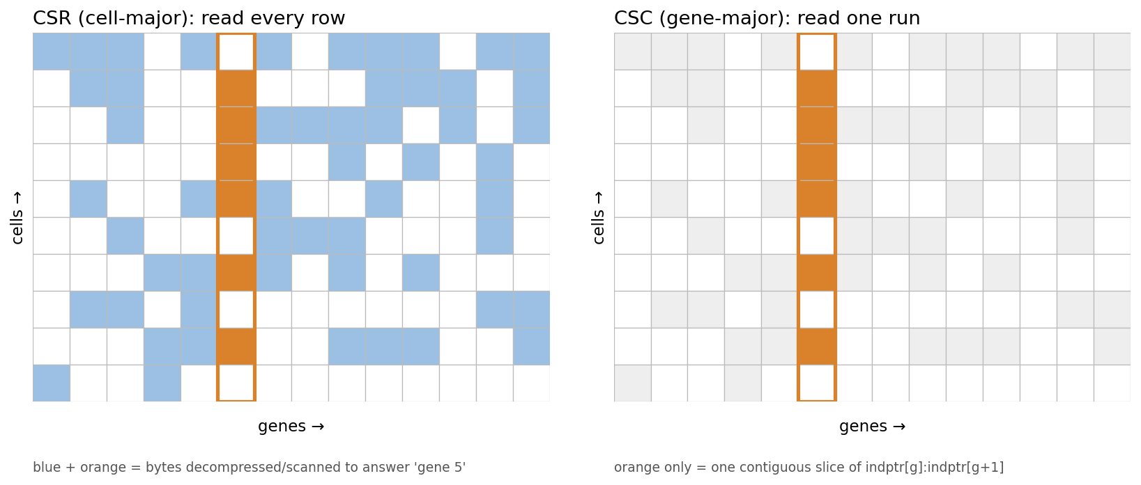
This was the one that mattered. Both matrices were CSR — compressed sparse row, cell-major. That is the scanpy default and it is the right layout for the things scanpy normally does: subset cells, iterate cells, compute per-cell QC.
It is the wrong layout for a dashboard. Every single thing the app draws is a column slice:
adata[:, gene].X          # colour a UMAP by one gene
adata[:, genes]           # dot plot across a gene panel
adata[:, gene].X.ravel()  # violin for one gene
On CSR, extracting one column means touching every row: 450 million nonzeros to retrieve roughly 25,000 values. On CSC — gene-major — the same query is one contiguous run.
Rewriting the store
The conversion does four things: drop layers, transpose to CSC, quantise, compress. Transposing 450 million nonzeros is a .tocsc() call and a few seconds of patience.
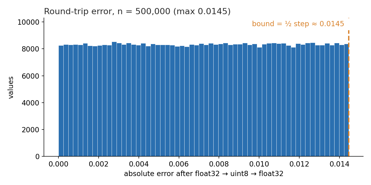
Quantisation deserves a sentence of justification. These are log1p-normalised values in [0, 7.38], and the dashboard uses them for two things: picking a colour off a ramp, and shaping a distribution. Neither needs 32 bits. Storing uint8 with a scale factor in uns costs one byte per value and a maximum error of half a quantisation step — about 0.014 on that range, or 0.2%.
One idea that seemed obvious and turned out to be worthless: dropping rarely-detected genes. Intuitively, a 35,228-gene matrix must be mostly noise. It is not, in the way that matters — nonzeros concentrate in the genes you would keep:
| Keep genes detected in ≥ | Genes kept | Nonzeros retained |
|---|---|---|
| 10 cells | 31,389 (89%) | 99.99% |
| 98 cells (0.1%) | 22,746 (65%) | 99.72% |
| 490 cells (0.5%) | 15,538 (44%) | 98.49% |
Dropping two-thirds of the gene list saves 0.3% of the bytes and costs the user two-thirds of the search box. Not a lever.
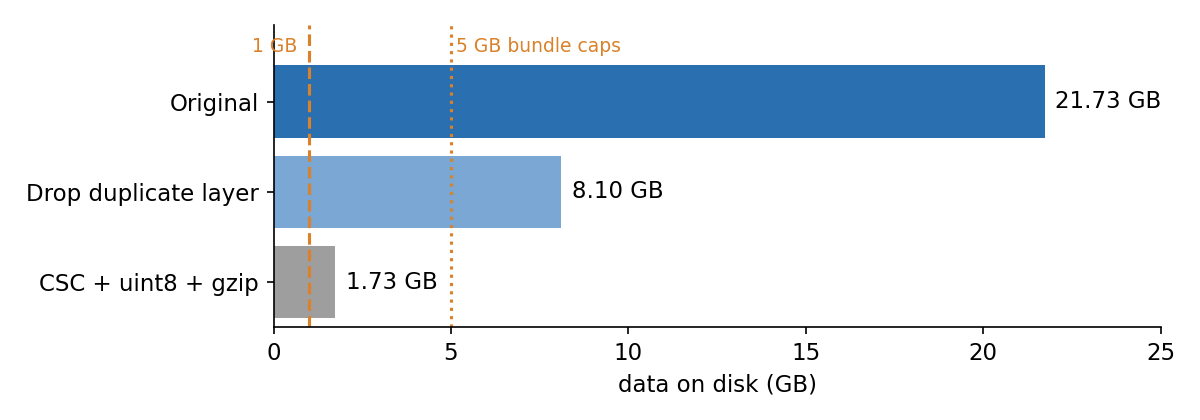
What the four real levers gave:
The part that actually fixed the speed
Smaller files are not in themselves faster. The speed came from no longer loading them.
The original loader was one line inside the server function:
def server(input, output, session):
    def load_adata(celltype):
        return sc.read_h5ad(path)   # the whole matrix, into RAM
Two things are wrong here and both are easy to miss in review. The function is defined inside server, so every browser session builds its own copy — nothing is shared between users. And the app had four separate @reactive.calc wrappers around it, one per tab, so a single user clicking through all four tabs loaded the same object four times.
For the epithelial file that is roughly 7.2 GB per copy: 450M nonzeros × 4 bytes of data × 4 bytes of indices, doubled because read_h5ad brings layers along. One user, one dataset, over the 8 GB ceiling.
With a gene-major file on disk, none of that is necessary. Cell metadata and UMAP coordinates are small and get read once per process. The matrix stays on disk and gives up one column at a time:
def gene_vector(self, gene):
    pos = self._gene_pos[gene]
    start, stop = self.indptr[pos], self.indptr[pos + 1]
    with self._lock:
        rows = self._h["X/indices"][start:stop]
        vals = self._h["X/data"][start:stop]
    out = np.zeros(self.n_obs, np.float32)
    out[rows] = vals.astype(np.float32) * self.scale
    return out
Roughly twenty lines, including the lock that keeps the HDF5 handle safe across Shiny’s async workers. The result is a per-session cost that no longer depends on how big the underlying object is.
| Metric | Value |
|---|---|
| Peak RSS, all four datasets open and a plot rendered | 398 MB |
| Median single-gene fetch from disk | 1.7 ms |
| Time to open all four datasets | 0.31 s |
| Reduction on disk | 12.5× |
The 398 MB figure includes about 255 MB of Python, scanpy, matplotlib and Shiny just existing. The data layer contributes well under 50 MB per session.
The bottleneck that wasn’t in the data
With the storage fixed, the page still froze on load — long enough that reloading the tab returned a connection timeout, which looks exactly like a server problem and is not one.
The server log said what it was:
Creating gene UI for Epithelial with 35228 genes
Three gene pickers, each rendering all 35,228 options as DOM elements. Around 105,000 <option> nodes delivered over the websocket. The browser’s renderer blocks building them, and because the renderer is blocked, the reload that the user tries next cannot be serviced either.
Shiny for Python has the fix built in — update_selectize(..., server=True) keeps the list on the server and ships only what matches as the user types. The catch is ordering: the control must exist in the DOM before the update arrives. Built inside a @render.ui, it sometimes did not, and the update landed on nothing. Making the input static in the layout and populating it from a @reactive.effect fixed it for good.
Worth internalising: a frozen tab is indistinguishable from a dead server, and both the symptom and the user’s instinctive fix (reload) point away from the real cause. The server access log, which kept answering 200 in 2 ms throughout, was the thing that located it.
Plots: aggregate, don’t round-trip
The dot plot and violin tabs were handing scanpy an AnnData and asking for a figure. For a dot plot, scanpy needs mean expression and fraction expressing per gene × group — which is one pass per gene over a column you already have:
codes = pd.Categorical(obs[groupby], categories=cats).codes
counts = np.bincount(codes, minlength=n)
for i, g in enumerate(genes):
    v = ds.gene_vector(g)
    means[i] = np.bincount(codes, weights=v, minlength=n) / counts
    fracs[i] = np.bincount(codes, weights=(v > 0), minlength=n) / counts
Six genes across sixteen groups: 0.02 s, no AnnData constructed. Validating it against a plain pandas groupby took one throwaway script and is the reason I trust the numbers.
The violin tab had a worse problem than speed. Its jitter layer — on by default — plotted every cell in every group: 192,000 points per panel. But the deeper issue was statistical. A violin over 192,344 cells implies n = 192,344, when the experimental unit is the donor and there are 30 of them. Cells from one donor are not independent observations, and treating them as such is the best-documented way to manufacture false positives in single-cell differential expression.
Replacing it with mean expression per donor, as a box plot with every donor drawn as a point, fixed the speed problem as a side effect of fixing the statistics. It also solved the thing that prompted the change: zero-inflation. Averaging 70–100 cells per donor turns a spike at zero into a continuous value a box plot can describe.
The visual default worth changing
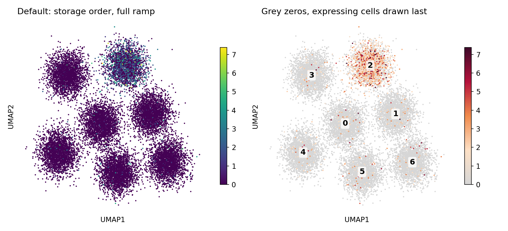
One more change that costs nothing and is purely about reading the plot. Colouring a UMAP by expression with a standard sequential ramp puts non-expressing cells at the bottom of the ramp, where they compete with real signal; and plotting in storage order means the last-drawn cells win, which on a sparse marker means the zeros bury the positives.
Two lines: fade the bottom of the ramp to grey, and sort by value so expressing cells draw last.
What didn’t matter
Early on I assumed the UMAP rendering was part of the problem and suggested rasterising with datashader. Measured, a categorical UMAP of 192,000 cells draws in 0.11 s. matplotlib was never the bottleneck; the 8.4 GB load sitting in front of it was.
That is worth stating plainly because it is the kind of assumption that sends you off optimising the visible thing instead of the slow thing. Datashader is still a reasonable upgrade for 200,000 overplotted points — but as a legibility improvement, not a performance fix, and it should be argued for on those terms.
Where it landed
| Before | After | |
|---|---|---|
| Data on disk | 21.73 GB | 1.73 GB |
| Peak RSS (one dataset) | ~7.2 GB | < 50 MB |
| Single-gene fetch | full-matrix scan | 1.7 ms |
| Open all four datasets | minutes | 0.31 s |
| Gene picker payload | 105,000 options | server-side |
| Deployable | no | 1.88 GB bundle |
A later addition — SCENIC regulon activity as a second modality — went through the same pipeline with one change. Those AUC matrices are 38–65% dense, so CSC would spend more on indices than on values; they are stored dense instead, chunked one regulon per chunk, so a single read still decompresses exactly one column. 1.57 GB became 150 MB at 0.6–1.1 ms per regulon.
If you are looking at the same wall
Roughly in order of return:
- Ask the file what is in it. Sum HDF5 storage per group before touching anything. Duplicated layers and uncompressed arrays are common and invisible from Python.
- Match the layout to the query. A dashboard reads columns; scanpy writes rows. Transposing to CSC is a one-time cost paid at build.
- Quantise deliberately.
uint8with a recorded scale is fine for anything that drives a colour ramp or a distribution. Assert the error bound in a test. - Load once per process, not per session. Check where your loader is defined — inside the server function means per-user copies.
- Never ship a 35,000-item picker to the browser.
- Aggregate to the experimental unit. Faster and more honest at the same time.
- Measure before optimising the visible thing. The slow part is rarely the part you can see.
Figures use synthetic data generated to match the real objects’ sparsity and value ranges. Size, latency and memory numbers are measured from the production objects: four human lung single-cell datasets, ~605,000 cells × 35,228 genes.
Comments
Leave a comment using your GitHub account. Your feedback is appreciated!